Canadian Partnership for Tomorrow Portal

URL: portal.partnershipfortomorrow.ca
Summary:
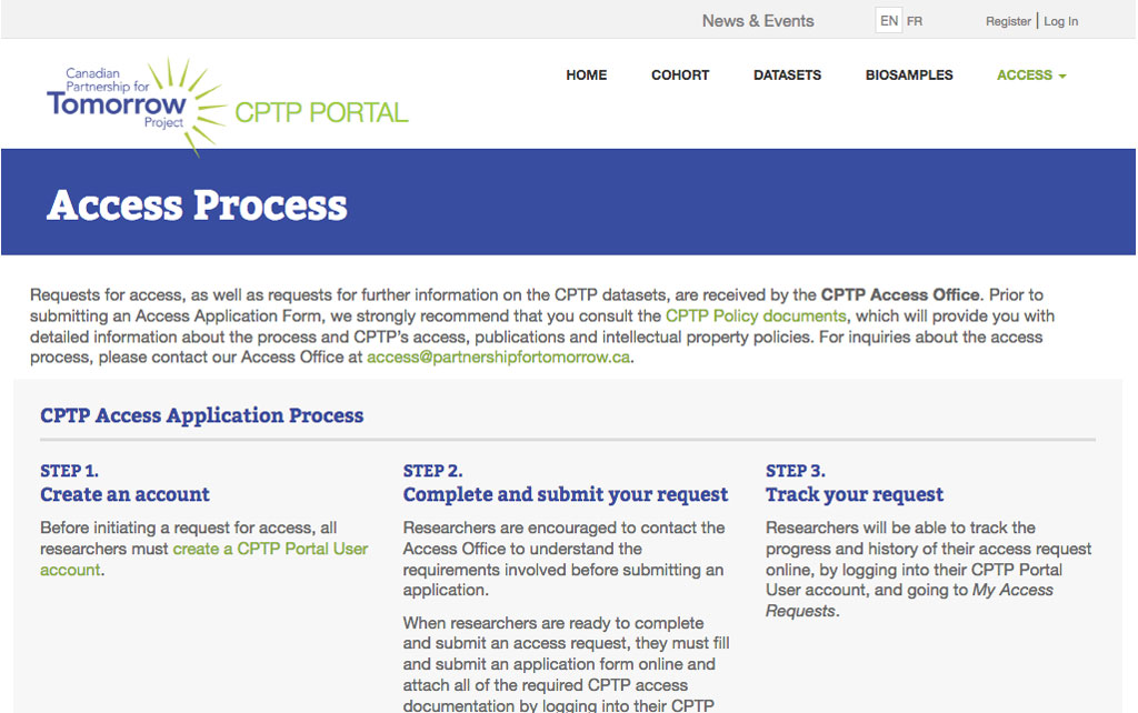
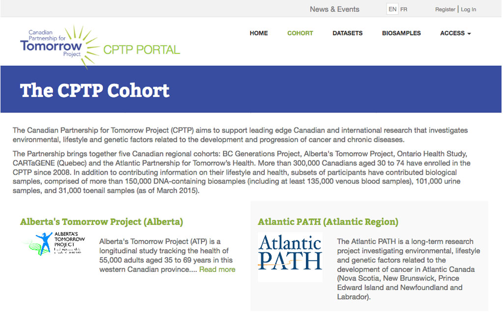
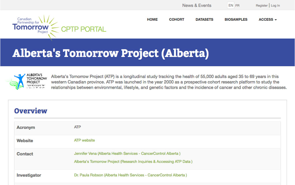
- The stakeholders wanted the website to match the look and feel of the parent website which was developed by a different team using a different framework. This included the look and feel of the portal’s search pages which uses yet another different framework.
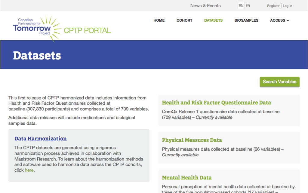
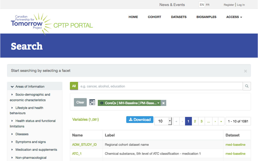
Access Process Page
Summary:
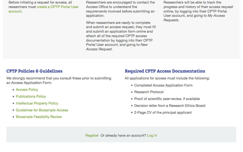
- Users needed to be able to quickly but clearly understand information around the request for access process. The stakeholders had the content around this in a one-column layout paragraph.
- The provided text was broken up into smaller chunks, and visual cues were added to make it easier for the user to scan the information.
