Thumbnail

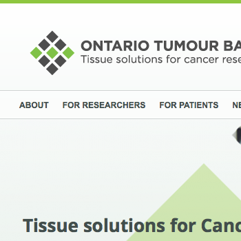
Ontario Tumour Bank Website

URL: ontariotumourbank.ca

* NOTE: Screen mockups shown may be different from what is currently live on the web.

Summary:

  • The stakeholders wanted to re-establish themselves as a program independent of the institution that hosts them. Up until then, the stakeholders had no unique branding and their web presence was a sub-section of the host institution’s website.
  • The most common feedback from users of their existing web presence was that they had difficulty finding what they were looking for. The stakeholders wanted this to be improved on the new website.
  • The stakeholders also wanted the website to encourage users to use the program’s other services, as well as attract new groups of users.
  • Personas and user scenarios were developed based on the stakeholders’ current web presence and project requirements. These were then used to propose a sitemap and web page layouts that would better meet user needs, both existing and new.
  • Branding for the stakeholders was developed separately from the website, and this in turn was used to develop the look and feel of the website.

ScreenshotScreenshotScreenshotScreenshot

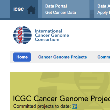
International Cancer Genome Consortium Website

Laptop and smartphone screenshots

URL: icgc.org

* NOTE: Screen mockups shown may be different from what is currently live on the web.

Summary:

  • The stakeholders requested a homepage redesign in order to accommodate the rapidly growing list of Cancer Genome Projects. All projects and detailed information about each needed to be accessible on the homepage.
  • The overall look and feel of the website wasn’t reflecting the stakeholders’ branding very well.
  • The relationship of the website with and to the ICGC Data Portal and ICGC Data Access Compliance Office was not clear to users.

ScreenshotScreenshot

User Pages

Summary:

  • The website has an extensive members-only area and these webpages needed to be especially user-friendly since most users were not expected to be technologically savvy.

Screnshot Screenshot Screenshot

Mobile Views

Summary:

  • The website had initially been developed as desktop-only and there was a request to make the website also accessible on mobile devices.

iPhone screenshots

Thumbnail

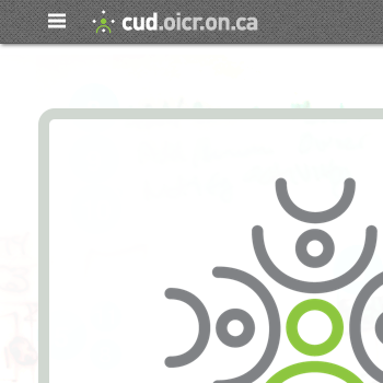
cud.oicr.on.ca


URL:
cud.oicr.on.ca

Summary:

  •  A new service was being launched for internal users and there needed to be a way to simply and quickly communicate what it was about.

Screenshot Screenshot

Administration Pages

Summary:

  • The new service is partially managed via a web app, and involves sending out a variety of notification emails to users. Not all users of the app nor email recipients were expected to be technologically savvy, so there was a need to make the app and emails as user-friendly as possible.

Screenshot Screenshot Email screenshot Screenshot

Mobile Views

Summary:

  • The website had initially been developed as desktop-only and there was request to make the website also accessible on mobile devices.

iPhone screenshots

Thumbnail

Canadian Partnership for Tomorrow Portal

URL: portal.partnershipfortomorrow.ca

Summary:

  • The stakeholders wanted the website to match the look and feel of the parent website which was developed by a different team using a different framework. This included the look and feel of the portal’s search pages which uses yet another different framework.

ScreenshotScreenshotScreenshotScreenshot

Access Process Page

Summary:

  • Users needed to be able to quickly but clearly understand information around the request for access process. The stakeholders had the content around this in a one-column layout paragraph.
  • The provided text was broken up into smaller chunks, and visual cues were added to make it easier for the user to scan the information.

ScreenshotScreenshot

Thumbnail

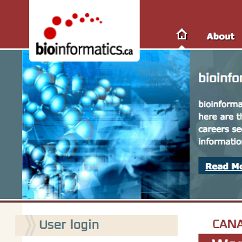
bioinformatics.ca

URL: bioinformatics.ca

* NOTE: Screen mockups shown may be different from what is currently live on the web.

Summary:

  • As part of a redesign of their website, the stakeholders wanted to emphasize that bioinformatics.ca was more than just the Canadian Bioinformatics Workshops series, and encourage users to access the other features of the website. They also wanted to draw more attention to the fact that past course material was available on the website for free.
  • Personas and user scenarios were developed based on the stakeholders’ current site and project requirements. These were then used to propose a sitemap and webpage layouts that would better meet user needs.

ScreenshotScreenshotScreenshotScreenshot

Mobile Views

Summary:

  • The website had initially been developed as desktop-only and there was request to make the website also accessible on mobile devices.

iPhone screenshots

Canadian Bioinformatics Workshops Registration

Summary:

  • Users registering for workshops were being taken to a 3rd party website, but they were most likely not expecting this to happen. There needed to be a way to visually tie content on the website to that on the 3rd party website so that the transition between the 2 websites didn’t disorient the user.

ScreenshotEmail screenshot